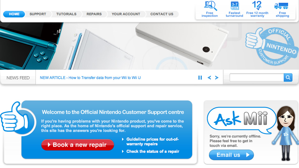
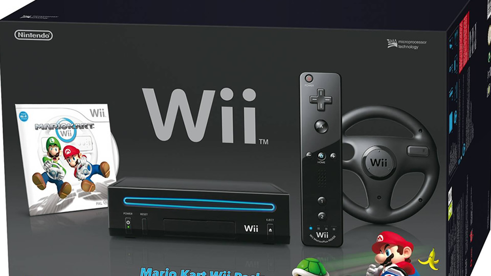
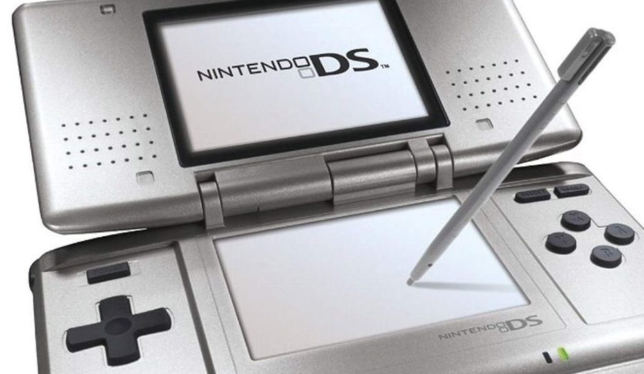
We focus on crafting engaging and functional digital experiences. When working with Nintendo, we designed and delivered their Customer Services website. Our goal was to make it intuitive, responsive, and easy to navigate, enhancing user satisfaction and efficiency in customer support while considering Nintendo’s client base.
User-centered design
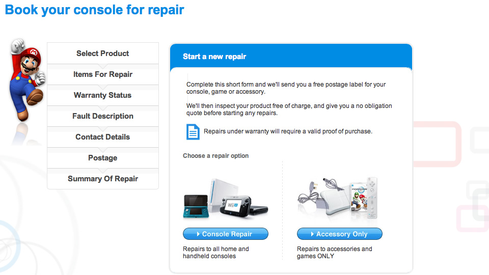
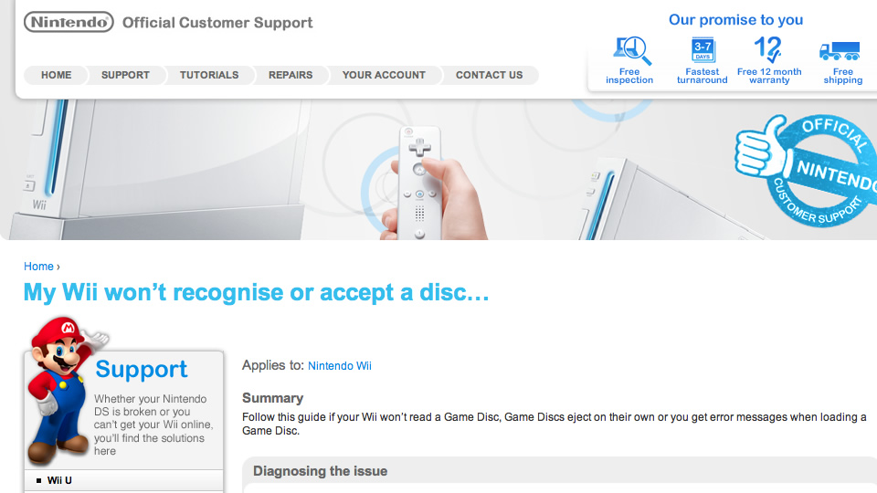
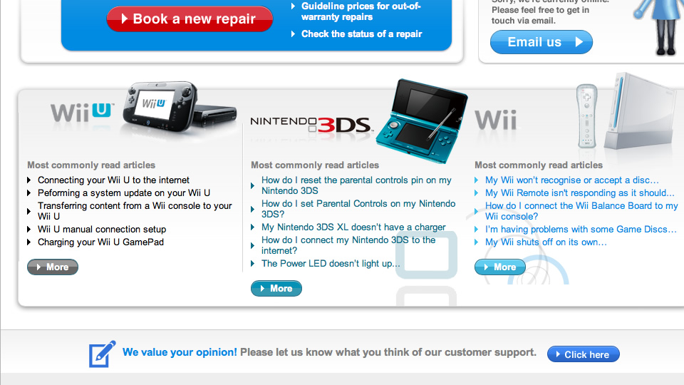
We used HTML, CSS, and JQuery to create a visually appealing and user-centered website. The site included sliders and other interactive assets to ease user experience. The clean, organised layout allowed users to find support information quickly. We designed the site with Nintendo’s branding, ensuring a cohesive look familiar to fans and Nintendo brand buyers, especially non-technical ones such as teenagers or young parents.
Our team implemented a transparent, intuitive navigation system, allowing users to easily reach their desired content by searching for a keyword or by navigating starting from their device selection and then indicating which potential issues might be relevant. Using JQuery, we incorporated dropdown menus, interactive buttons, and expandable sections. These features streamlined the user journey, helping customers find answers without hassle.
Accessibility
With many users accessing the site from mobile devices, we prioritised mobile responsiveness. CSS media queries ensured the website adapted to all screen sizes, maintaining usability and readability. This approach allowed Nintendo customers to access support information conveniently, wherever they were.
We built the front end on a bespoke back-end CMS provided by Nintendo to enable easy content management. Nintendo’s support team can now update FAQs, add new tutorials, or revise support articles independently. The flexible WordPress interface allows Nintendo to maintain up-to-date content, enhancing the site’s effectiveness over time.
Search engine optimisation
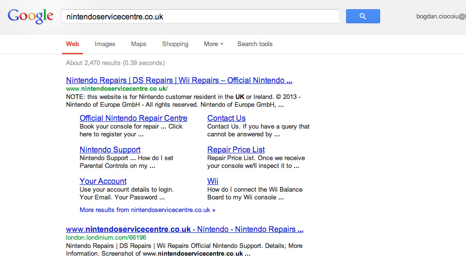
We optimised the website for SEO to ensure visibility in search engine results and that slow Internet connections will not impact our user base. We achieved this by leveraging lazy loading techniques. We improved the site’s discoverability using HTML5, heading 1, 2, and 3 hierarchical structures, meta tags, and alt text for static images. Additionally, we adhered to accessibility standards, ensuring compatibility with screen readers, Google’s SEO browser, and other assistive technologies.
We developed interactive FAQ sections and step-by-step tutorials using collapsable JQuery effects to assist users efficiently using screenshots and intuitive instructions. We undertook due diligence during our project design phase, concluded our target audience and typical personas, and influenced our design accordingly. Customers can now find quick answers, view tutorials, and get product support quickly. These features reduced the need for direct customer support interactions, making the site a powerful self-service tool.
The final Customer Services website provided a seamless, user-friendly experience that reflects Nintendo’s dedication to customer satisfaction. At the end of the project, the website supported Nintendo’s customer service goals with responsive design, easy content updates, and optimised navigation. Our collaboration demonstrated our commitment to delivering digital solutions that are both engaging and practical, helping Nintendo provide exceptional support to its customers.
