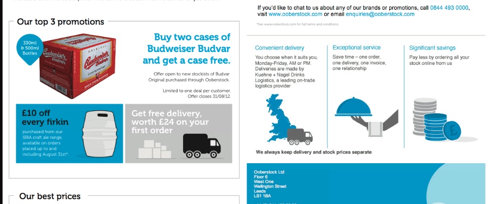
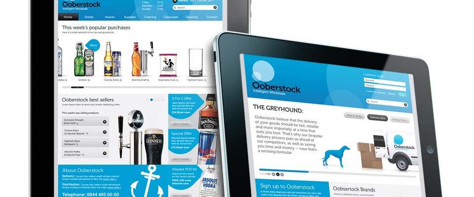
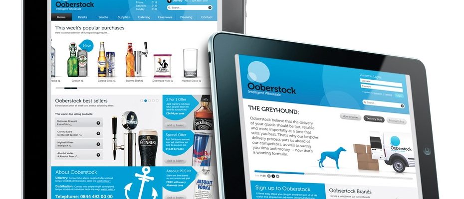
We specialise in delivering robust front-end solutions with HTML, CSS, and JavaScript. We collaborated with Ooberstock, an innovative drinks distributor, to enable them to upgrade their website. We aimed to enhance user experience, improve responsiveness, and modernise the design, creating a site that reflects Ooberstock’s dynamic brand.
We began by redesigning the website layout, using HTML5 for a structured, accessible foundation. Our team crafted a responsive design as a vectorial static multi-layer drawing, ensuring seamless navigation across desktops, tablets, and mobiles. Using CSS media queries, we adjusted layouts and optimised images to load smoothly on any screen size. This responsive approach allowed Ooberstock’s customers to explore products effortlessly, whether at home or on the go.
Interactive elements
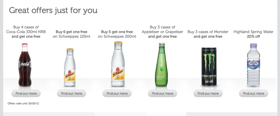
To elevate user engagement, we integrated JavaScript-powered interactive elements. We added product sliders and carousels to showcase Ooberstock’s diverse offerings in a dynamic, visually engaging way. Customers could browse and compare products with ease, improving their shopping experience. Additionally, we implemented “add-to-cart” animations and hover effects that enhanced usability and made interactions intuitive and satisfying.
Website speed is critical for retaining customers. We optimised images, minified CSS, and compressed JavaScript files to ensure fast load times. This approach reduced data transfer and improved performance, allowing pages to load quickly, even with high-quality visuals. The enhanced speed created a smooth browsing experience, reducing bounce rates and encouraging a more profound exploration of Ooberstock’s offerings.
Enhancing navigation
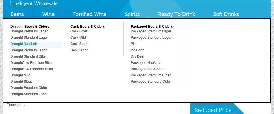
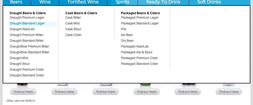
We improved navigation by designing customised drop-down menus that enable users to find products effortlessly. We added smooth animations to these menus using CSS transitions, creating a polished look and feel. These refinements helped users efficiently navigate Ooberstock’s wide selection of beverages, boosting engagement and supporting conversions.
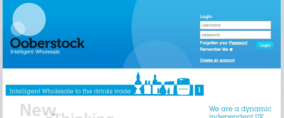
Our team applied consistent CSS styling across the site to reflect Ooberstock’s brand identity. We formulated a cohesive colour scheme, fonts, and iconography aligned with Ooberstock’s vibrant, modern image. This unified design helped build brand recognition, ensuring a memorable experience for every visitor.
The upgraded Ooberstock website now offers a responsive, user-friendly experience, rich with interactive features and optimised speed. Our work with HTML, CSS, and JavaScript empowered Ooberstock to showcase its products effectively, connecting with customers through a seamless digital experience. This collaboration highlights our commitment to creating high-quality front-end solutions that engage users and drive business growth in competitive online markets.
